CoverMyMeds Refresh
COVERMYMEDS
Design | Branding
Brush strokes are so last year.
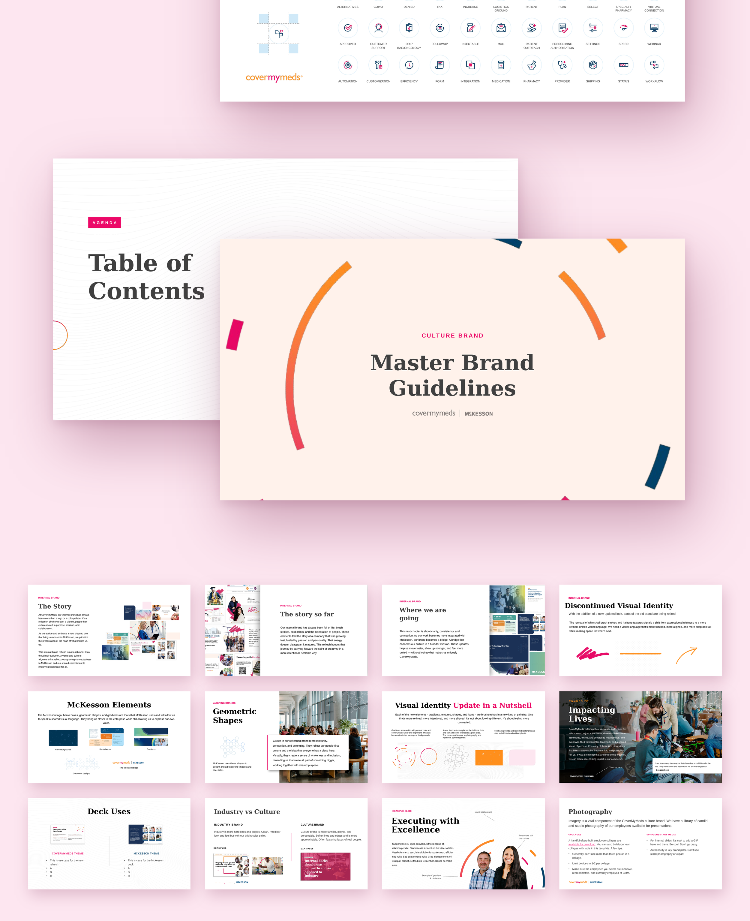
CoverMyMeds needed internal branding that reflected both its own identity and its place within a larger healthcare segment. Over time, materials created for different teams, events, and initiatives had drifted in look and voice so refreshing and aligning the internal brand created a more cohesive experience across all platforms and made every piece feel recognizably part of one company.
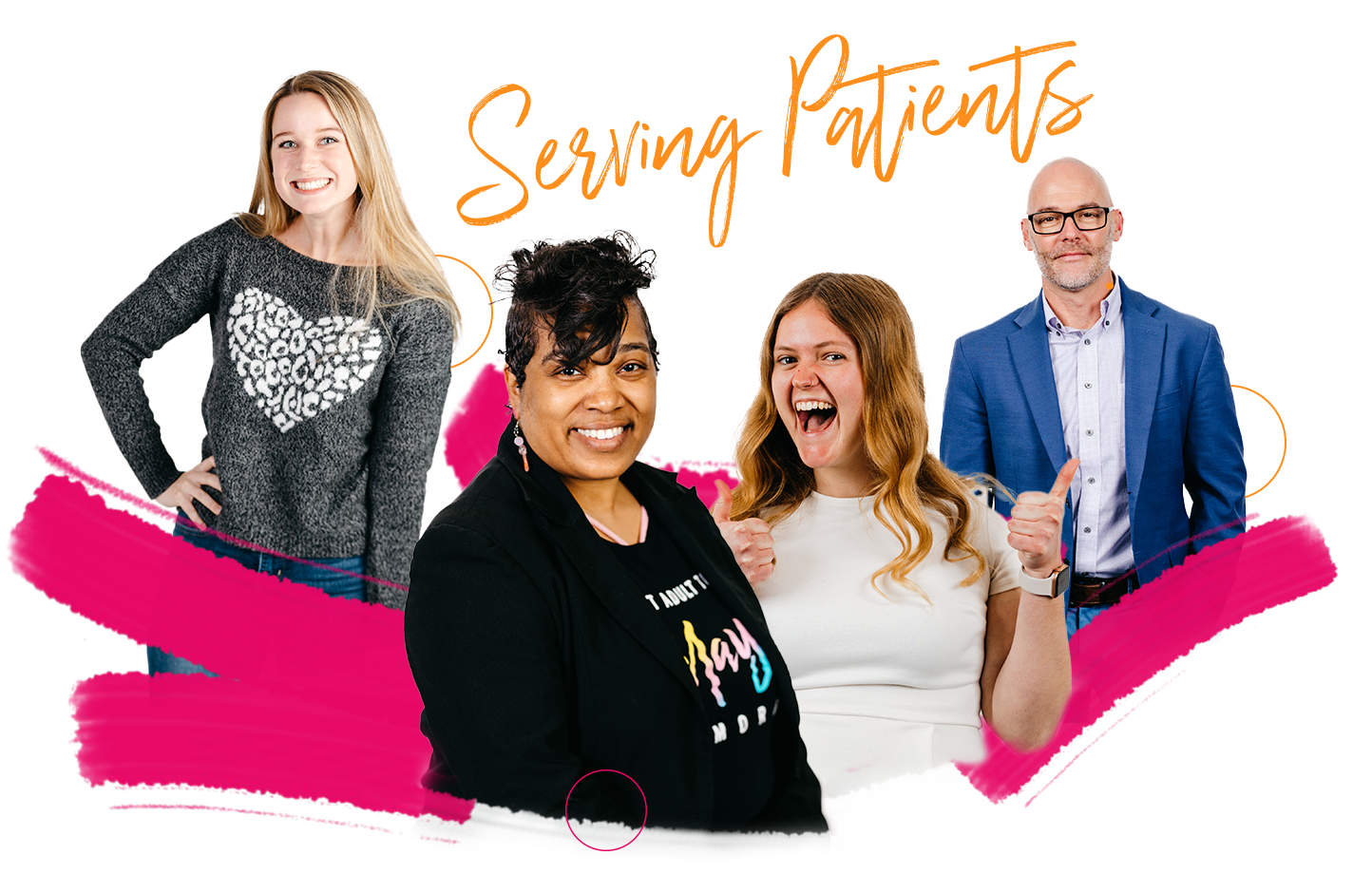
The old established look
Culture at CoverMyMeds has long since been valued and a brand was originally created around that. The brand was fun, whimsical and relatable. It was an effective look for its time with brush strokes and geometric shapes but started showing its age.

The new look
As CoverMyMeds grew under the umbrella of McKesson, the need for alignment became more and more clear. I’m in effort to align and become one cohesive company under McKesson we overhauled the look.